How do you redesign an app for efficient task completion?
At Tata Consultancy Services, I was responsible for simplifying TCS’s Ultimatix app to help users complete tasks quickly and seamlessly.
Ultimatix App
ROLE
Research, UI/UX Design
WORKED WITH
Designers, Developers, PM’s and Leadership
DURATION
14 weeks
Approach
I tackled the project in three phases.
Discovery- Heuristic evaluation, Competitor analysis, User interviews. Ideation- Affinity mapping, Persona Development, User journey map. Design- Information architecture, Design guide, wireframes, usability testing, High fidelity screens.
Research & Discovery
For the project, I conducted comprehensive research using heuristic analysis, competitor analysis, and user interviews. As the sole designer, I reached out to both new TCS joiners and current employees to conduct need-finding, ensuring the design solutions were well-aligned with their needs and expectations.
Goals • Leveraged findings to inform design decisions. • Assessed the UX of the app to identify usability issues that conflict with known best practices. • Captured the user's voice so that it could inform the design process.
Heuristic Review
Before delving into design, I independently conducted a comprehensive design audit, scrutinizing every screen of the application to pinpoint improvement possibilities. I collaborated closely with the Product Owner (PO), who performed his heuristic review, utilizing Jakob Nielsen's Heuristic Evaluation method to assess usability. Together, we merged our findings to develop improved solutions. To validate these enhancements, we conducted usability tests with users during our interview sessions, and interestingly, our suggestions closely aligned with the feedback we received from the tests.
Key findings- • No progress indicators or notifications during installation/updates, leading to confusion. • App names and logos fail to convey their purpose effectively. • Missing back button and non-functional home button reduce user control. • Inconsistent UI with misaligned elements and mismatched ratings. • Vague error messages and unintuitive actions like device removal. • Cluttered design with excessive navigation bars and poorly emphasized essentials. • Inefficient search due to unlinked keywords and unclear app names. • Lack of onboarding screens and accessible help documentation limits user support.
Competitor Analysis
After conducting a heuristic evaluation, I studied competing apps with a focus on understanding their features and identifying areas for improvement.
Our goal was to provide excellence to employees, ensuring they could complete tasks efficiently. The competitor analysis I performed included three companies: Apple App Store, Google Play Store, and Samsung Galaxy Store.
Prior to the analysis, I developed evaluation criteria to objectively assess each company and compare them to the UX app.
Key takeaways- • Apple and Google prioritize downloads better than Ultimatix. • Smoother onboarding and UI in Apple and Google reveal areas for Ultimatix to improve. • Competitors excel in in-app help and personalization, areas where Ultimatix can enhance user support.
User Interviews
After performing the heuristic research, I decided to conduct user interviews to better understand the needs and pain points.
We interviewed 20 individuals, using both qualitative and quantitative methods that provided contextual insights into their views, actions, and their likelihood of using the application.
The suggestions from our interview sessions closely aligned with our findings from both the competitive and heuristic analysis.
Key findings from interviews- • Sluggish performance and lag frustrate users. • App updates are only noted when the app fails, complicating navigation. • Confusing installation and content overload on the main page hinder user goals.
Ideation: Brainstorming & Iterating
After the discovery phase, I downloaded the findings and used them to define the design goals and approach. Since brainstorming is more effective collaboratively, I reached out to my team of designers for input. The focus was to clarify user needs and establish the project vision.
Downloading findings
The discovery phase produces a wealth of insights. Downloading the findings means identifying key themes from the research to guide the redesign. The goal is to visualize all the data and categorize it by patterns, revealing relationships across the findings.
Key Touchpoints- • Identify emerging patterns and group them into themes from the research. • Organize these themes visually to grasp the overall insights more clearly. • Use this understanding to craft a vision for the redesign, ensuring it aligns with the research findings.
User Personas
From the conversations we had, we spotted two common personas that represent the shared experiences and needs of all our interviewees. This way, we can understand and connect with our users on a more personal level!
Meet Maurya & Divya...
User Journey map
I also mapped out the key steps users take when interacting with the app. This helped me spot pain points and understand the overall flow, so we can make the experience smoother and more enjoyable for our users.
Key takeaways from the user journey - • Onboarding was confusing, needing peer help. • Search and app names are unclear. • No download progress or update alerts.
Design Phase
After creating the persona and establishing the vision for the project I moved into the collaborative designing and iteration phase. The goal of this phase focused on creating Information Architecture, wireframes, prototypes, and high-fidelity screens.
Information Architecture
The old user flow had quite a few steps and was tricky to get through. So, I organized the app’s content and structure to reflect how users naturally search and navigate. This helped me create a layout that feels intuitive, helping users find what they need quickly and effortlessly.
Design Guide
With a focus on consistency and usability, I developed a design guide that outlines visual elements, colors, typography, and interaction patterns. I ensured that the app’s design remained consistent across all pages, reflecting our refined brand identity.
Wireframes
We crafted low-fidelity wireframes to quickly capture the layout and flow of the app without focusing on detailed visuals. These wireframes allow us to iterate and test ideas early, ensuring the structure meets user needs before moving to high-fidelity design.
Usability Testing Feedback
After the ideation and wireframing phases were complete, we moved forward with user testing. I conducted virtual testing sessions with 7 participants using Microsoft Teams. These sessions allowed us to gather feedback in real time, observe user interactions, and identify areas for improvement based on their experiences with the new design.
The feedback we received- • "It's convenient when essential apps are easy to locate upfront, reducing the steps needed to find what I need quickly.” • “The bottom menu icons need labels, as 'Community' isn’t immediately clear.” • “Clean, minimal design that's easy to understand.” • “The toggle button for news is a great feature.” • “The profile section is much improved, with all important info easily accessible.” • “I like the Community feature; it would be great to see it expanded.”
Design Solution
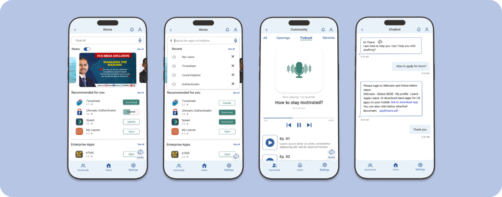
Homepage
Download and access apps quickly!
Improvements to the homepage include an embedded toggle for easy content filtering, an upfront download button for quick access, and categorized apps displayed in cards for added clarity.
Podcast
Learn while you work, no reading is required!
Podcasts are available for you to listen to interesting discussions with colleagues on a variety of knowledgeable topics. Instead of reading, you can tune in while working, making it easy to learn and stay informed.
Profile
View all your important information in one place!
The profile section provides information on the leadership associated with assigned projects and allows users to monitor ticket statuses for any raised issues. It also highlights awards and rewards achieved by the user, recognizing their contributions and accomplishments.
Join communities
Find friends and communities with similar interests!
Facilitates internal collaboration by allowing employees to connect, share ideas, and learn more about their colleagues for potential project partnerships. Access job openings and project listings easily within TCS.
The UX app redesign on iOS and Android has positively impacted user experience, resulting in an increase in downloads. Looking ahead, we’re preparing to expand the Community feature, allowing users to connect with each other more easily.
• User queries and support tickets were reduced by 80%. • Organic downloads increased by 74%.